Overview
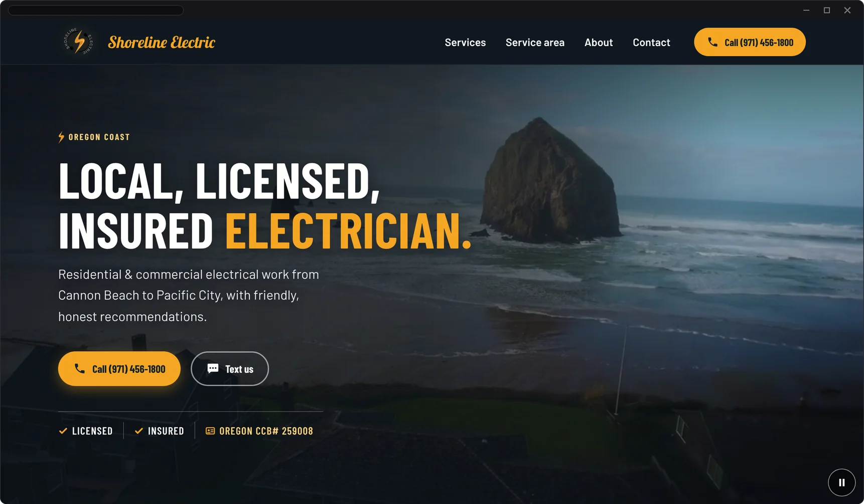
Shoreline Electric is a licensed & insured electrician on the Oregon Coast, in its first year of business. It does residential, commercial, and remodel work from Cannon Beach to Pacific City.
It’s also my family’s business. My dad owns it. That made this a real paid job with a real client, but one I had unusual access to, so I’ve been careful to report only what I measured.
The old site was a Canva template. It looked good on a big screen. On a phone it took 15.5 seconds to show its main content, the page weighed 13.3 MB, the phone number wasn’t tappable, and the icon links had no labels for screen readers. The business didn’t own the code, and the site lived on a Canva subscription.
I redesigned the site around one job, getting customers to reach the business, then built it from scratch in code & moved the domain off Canva without touching the company email.
At a Glance PageSpeed Insights, mobile: October 27, 2026
- 55 → 100Mobile PageSpeed performance score
- 15.5 s → 1.7 sTime to show the main content on a phone (LCP)
- 13.3 MB → 1.9 MBPage weight, about 7× lighter
- 0 ErrorsWAVE accessibility errors & contrast errors
My Role
I handled the whole project on my own: research, design, code, testing, hosting, and the domain move. I’m a front-end oriented web designer & developer. I use UX/UI principles to decide what goes where: clear hierarchy, short paths to the main actions, and layouts that work on any screen.
- UX ResearchCompetitor sites, site audit, baseline tests
- UI DesignLayout, navigation, van illustration, highway sign
- Front-End BuildAstro, HTML, CSS, a little JavaScript
- AccessibilityWCAG 2.2 AA: contrast, keyboard, alt text, motion
- Local SEOTitles, schema, sitemap, share image
- LaunchHosting, DNS, keeping company email safe
- Moved from
- Canva website builder
- Moved to
- A hand-built Astro site, code on GitHub, hosted on Vercel Pro
- Kept from the old site
- The logo, the drone video, the services list, and the towns served
- I designed & built
- Layout, navigation, the van illustration, the Highway 101 sign, all of the code, the share image, plus the domain & hosting setup
- Project value
- $2,800
UX Research & Discovery
Someone with a dead outlet or a tripped panel wants three answers, fast: Do you do this kind of work? Do you come to my town? How do I reach you?
I researched other electricians’ websites to see how trades businesses present their services, service areas, and contact options. Then I went through the Canva site the way a customer would, on a phone, and ran baseline tests before I changed anything.
What the Old Site Showed
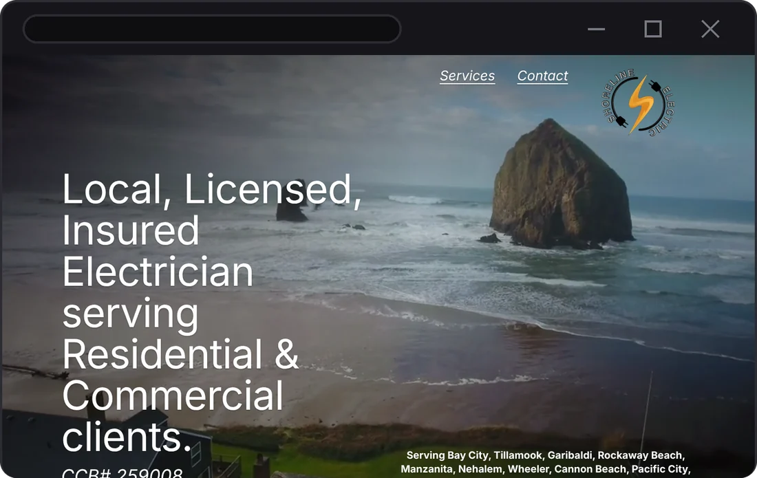
- The navigation was two underlined text links, Services & Contact, floating over the video.
- The phone number was plain text, written “(971)456-1800.” On a phone you couldn’t tap it to call.
- White text sat right on a bright beach video with nothing behind it.
- Six images had no alt text, and four icon links had no name for screen readers.
- A leftover Canva placeholder, “Your paragraph text,” was live on the page.
- No structured data, so Google had to guess the business details.
Behind the Scenes
The baseline report showed where the 13.3 MB went: two background videos (12.5 MB & 7.3 MB files), a 2 MB Canva script, and six or more font files. Most of the business’s work comes in by phone, and customers text, call, or email. So every decision got judged on one question: does this make reaching the business easier?
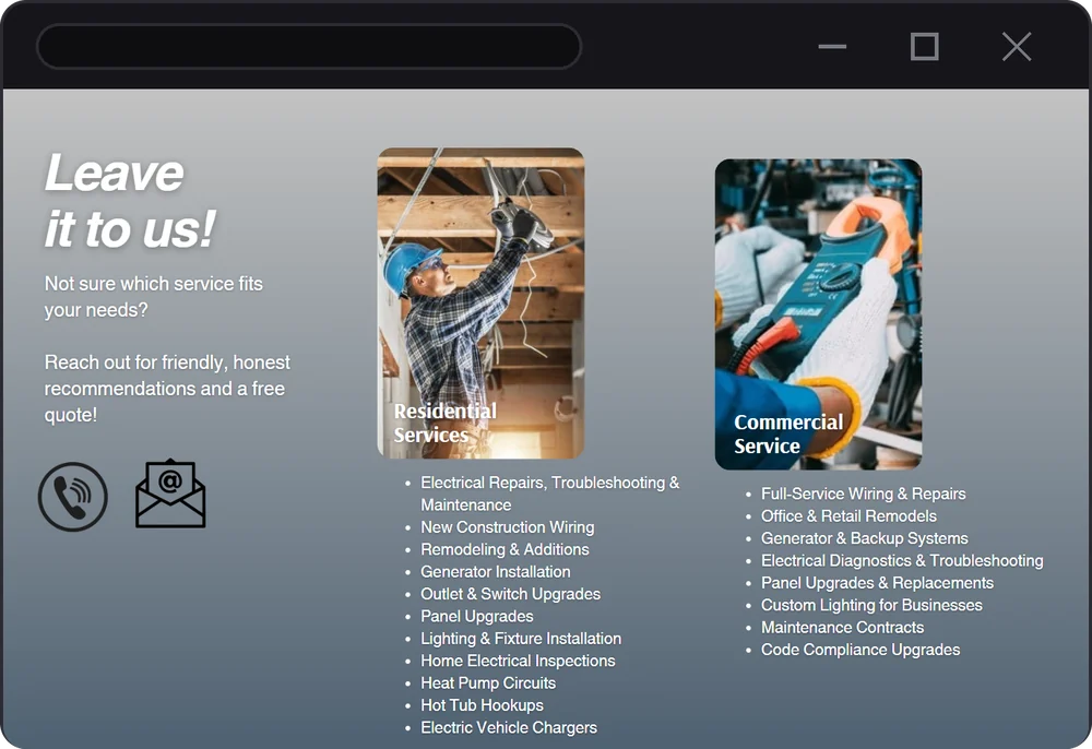
The Customer Path I Designed Around
- FindSearch for an electrician on Google or Maps
- CheckDo they do this work? Are they licensed?
- ConfirmDo they come to my town?
- Reach outCall, text, or email in one tap
From Problem to Design Decision
| Problem on the old site | What I changed |
|---|---|
| 15.5 s to show the main content on a phone | A static site with no builder script, one compressed video with a still poster frame, and two self-hosted fonts |
| The phone number wasn’t a link | Call, Text, and Email are one-tap links in the hero, the header, and the contact section |
| White text on a bright video | A dark gradient behind the text, checked frame by frame for contrast |
| Two floating text links for navigation | A sticky header with Services, Service area, About, Contact, and a Call button |
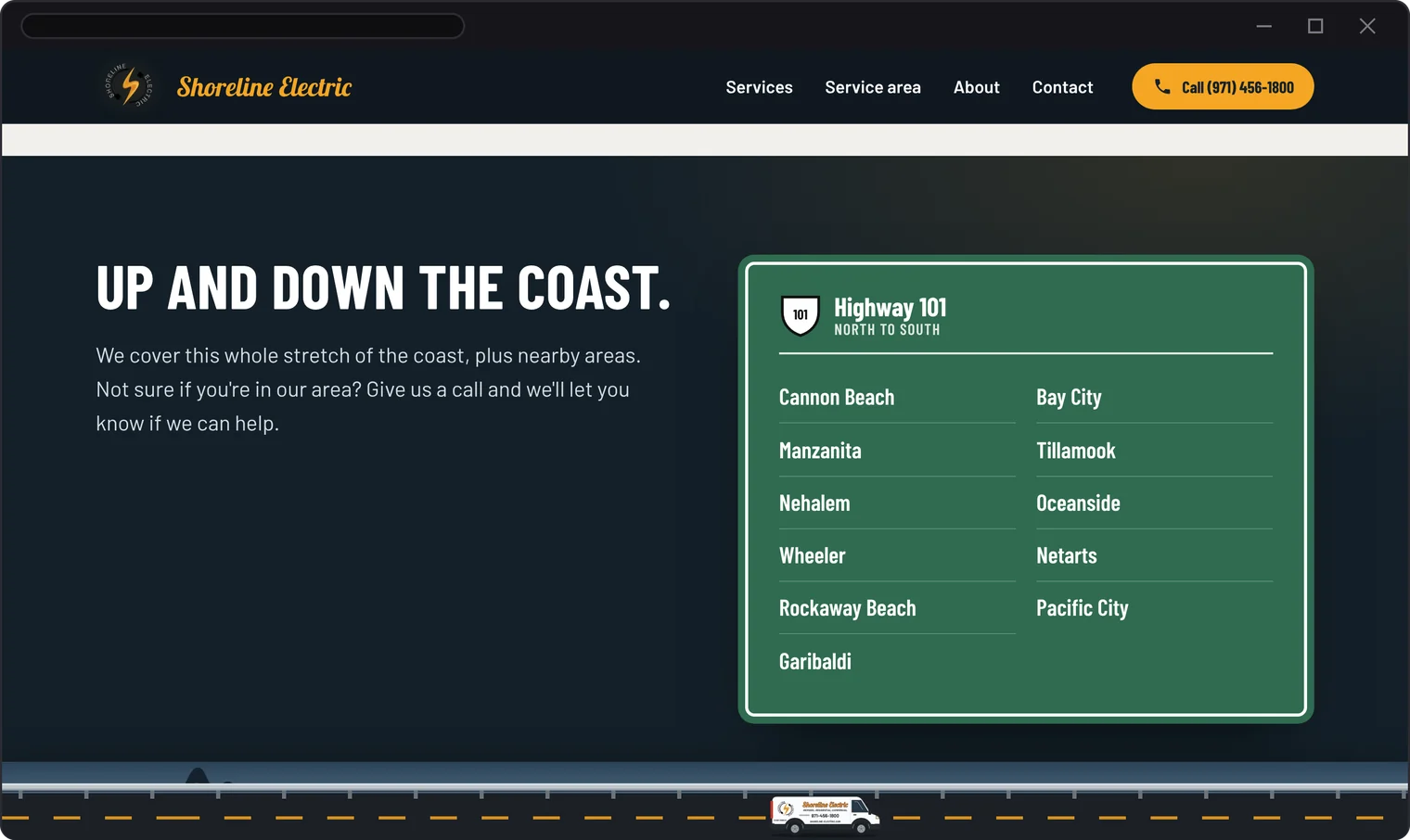
| Towns listed in a small paragraph | A Highway 101 road sign that lists every town, north to south |
| Unlabeled icons & images | Every link has a text label, and every image has alt text or is marked decorative |
Before & After: The Homepage
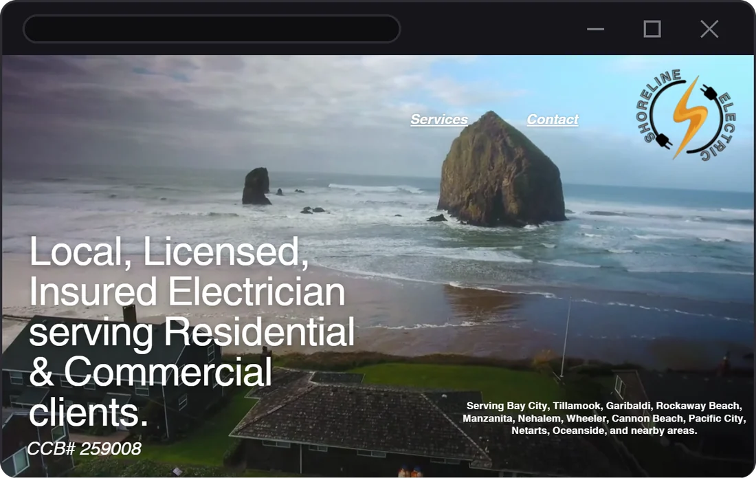
Nice Video, No Way to Call
- Navigation: two underlined links
- No call, text, or email button above the fold
- White text right on the bright video
- 13.3 MB to download before it settles
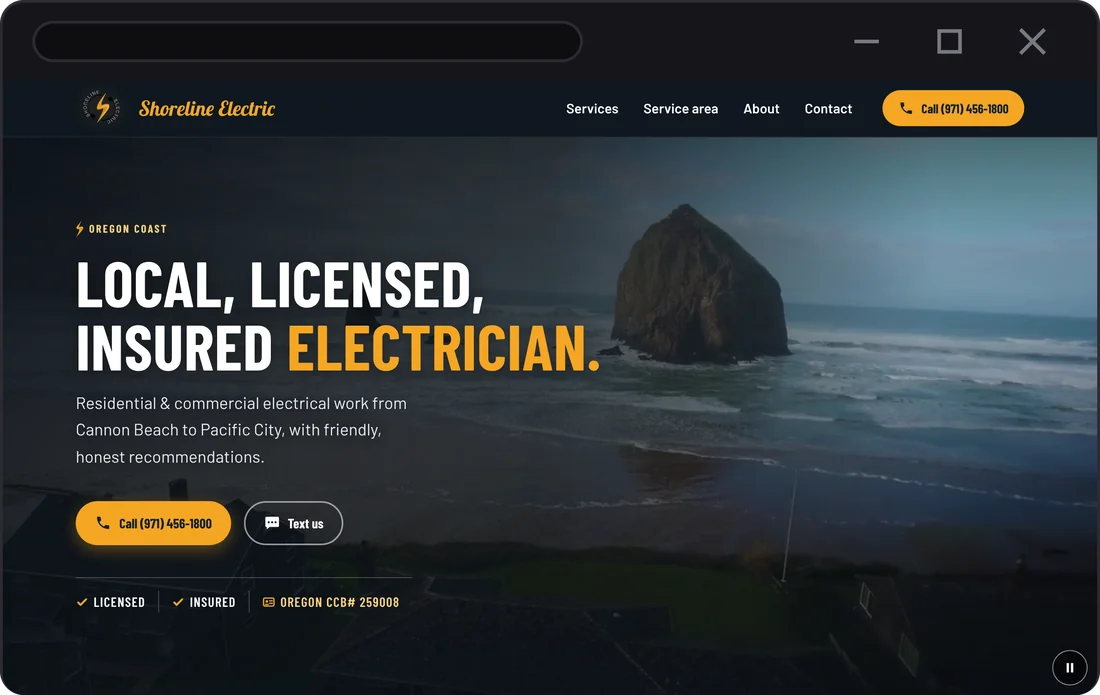
Call or Text From the First Screen
- A Call button in the sticky header, on every scroll position
- Call & Text us right under the headline
- The license number in the first screen
- Same drone video, compressed, with a pause button
Before & After: On a Phone
-
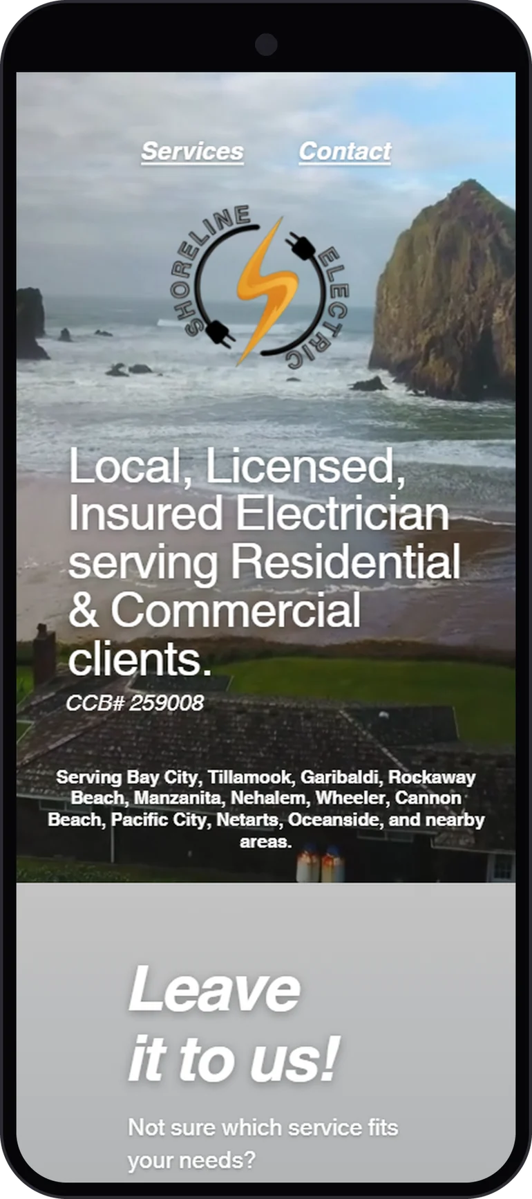
Before Canva first screen -
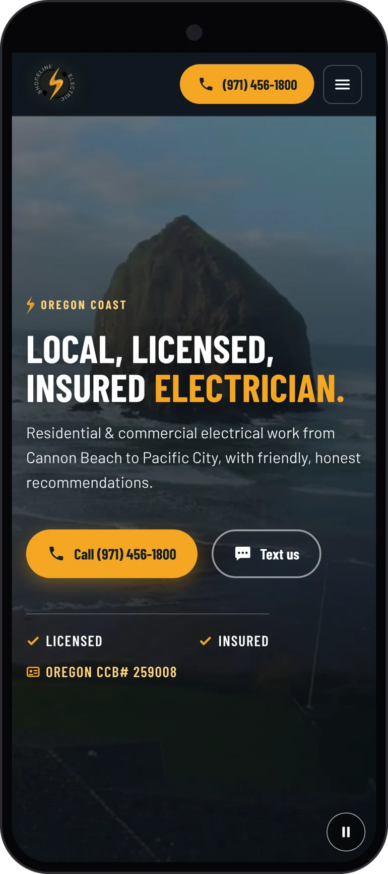
After First screen -
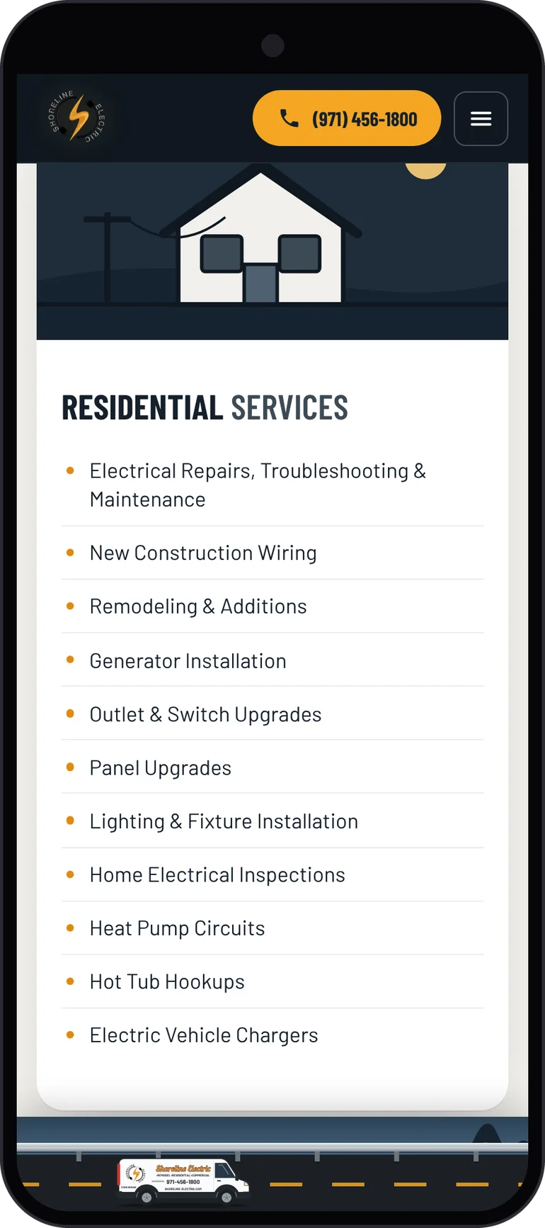
After Services -
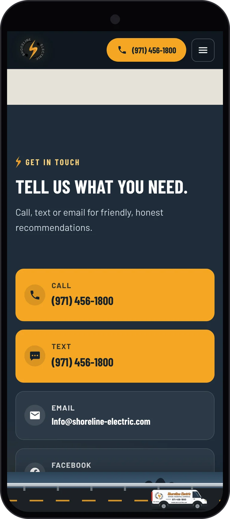
After Call, text, or email
Before screenshots were captured from the Canva site on October 25, 2026. After screenshots were captured from the production build at the same widths: 1366 px desktop & 412 px phone.
Design & Development Approach
Iteration 1: A Faithful Rebuild
The first brief was a rebuild, not a redesign: same layout, copy, photos, and video, just fast, accessible, and owned by the business. I built that version first.
Seeing it next to the original made the real problem clear. Fixing what visitors can’t see wasn’t enough. The layout itself still had no clear place to call, and it still read like a template. So I changed direction to a custom redesign, and I kept the rebuild on its own branch as a fallback.
Iterating on the Redesign
- An illustrated coast scene replaced the video in the hero. It didn’t feel like the business, so the original drone video came back, darker & compressed.
- The first heading font was too wide. Barlow Condensed matched the lettering on the real van much better.
- The service area went from a paragraph of towns to a Highway 101 road sign.
- A road strip with the work van went along the bottom of the screen & got simpler with each pass: a town sign, tick marks, then just the road, a guardrail, and the coast’s landmark rocks.
Visual Direction: Drawn From the Van
The business’s strongest brand piece isn’t its website. It’s the white work van with the orange script lettering that drives around the coast every day. I drew the van from a photo, panel by panel, and pulled the site’s look from it: white & dark navy panels, the orange script, bold condensed caps, and amber for every action.
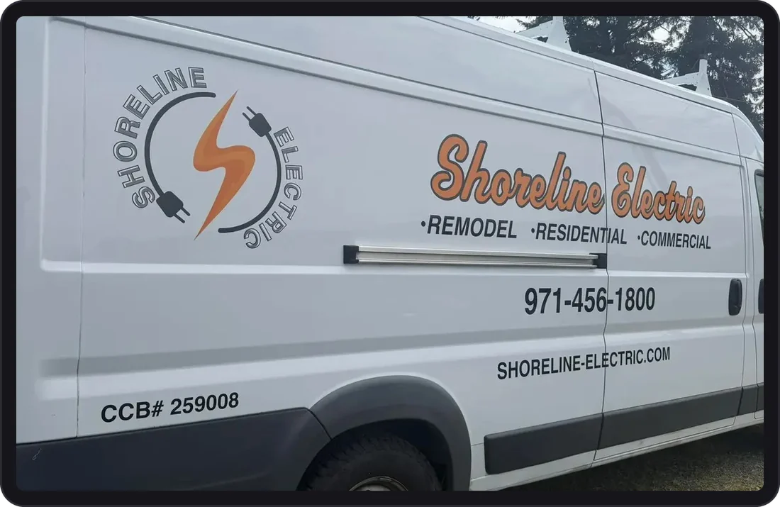
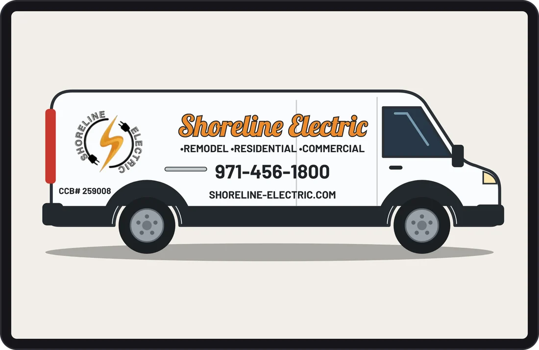
On the live site, the van drives along a strip of coast road at the bottom of the screen as you scroll. It passes Haystack Rock, Twin Rocks, and Three Arch Rocks near their towns, and reaches the end of the road at the contact section. Scroll back up and it turns around to show its driver side. It’s decorative, so screen readers skip it, and the turnaround animation is switched off for anyone who has reduced motion turned on.
The Build
Why Astro
Astro lets me write plain HTML & CSS in small components, then builds them into ordinary static pages. It ships no JavaScript unless I ask for it, so the page loads fast by default. All the business facts (phone, email, towns, services) live in one data file, so they’re the same everywhere they appear.
From the first build on, every round of changes went in as a pull request with its own private preview link: 15 in all between October 25 & 28, each one checked on a preview before it went live.
Navigation
- Services
- Contact
Underlined text links over the video. No call button.
- Services
- Service area
- About
- Contact
- Call
A sticky header. On phones, the Call button stays in the header & the links move into a menu.
Accessibility: WCAG 2.2 AA
- Contrast over the drone video, measured from screenshots taken every 3 seconds of the clip: white text at 9:1 or better, the amber word at 4.6:1 or better.
- A skip link, a visible focus style on every link & button, and nothing hidden under the sticky header.
- A pause button on the video, which never autoplays with reduced motion turned on.
- Tap targets at least 24 px, and no sideways scrolling from 360 px phones to 1920 px desktops.
- No layout shift as the fonts load (CLS 0).
What WAVE Taught Me
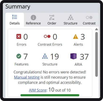
My first WAVE run on the new site found 4 errors & 11 contrast errors. The 4 errors were decorative rock drawings missing an “empty alt” marker. The 11 contrast errors were the 11 town names on the highway sign.
The towns flip onto the sign when it scrolls into view. Before that they waited at 0 opacity, and WAVE checks the page frozen at load, so it saw invisible text. I changed the starting state so the towns wait turned edge-on at full color instead. They still look the same when they flip in, and they’re readable to every tool & screen reader. The final run: 0 errors, 0 contrast errors.
Lesson: automated checkers test the page frozen at load, so an animation’s hidden starting state counts as real content.
Moving Off Canva Without Breaking Email
The riskiest part of the project wasn’t the design. It was the domain. The company email runs on the same domain as the website, and one wrong DNS change would stop it.
Before touching anything, I looked up every DNS record & saved a copy of the email ones. At launch, only the records that pointed at Canva changed.
| Record | What it does | At launch |
|---|---|---|
| A record (main domain) | Points the domain at the website | Changed from Canva to Vercel |
| www | Handles “www.” in front of the domain | Pointed at Vercel, which redirects it to the main domain |
| Canva verification | Proved the domain to Canva | Removed |
| MX, SPF, DKIM, DMARC | Deliver company email & keep it out of spam | Not touched |
Vercel issued the HTTPS certificate, and the company inbox sent & received email after the switch. The business now owns its code, and nothing depends on a Canva account.
Local SEO: Getting Found
A local electrician gets found by town. The site needed to tell Google, in a format it can read, who the business is & where it works.
Search
- A page title & description written around the service & the coast.
- Electrician schema (structured data) with the name, phone, email, logo, and all 11 towns.
- It’s a service-area business, so the schema lists towns, not a street address.
- A sitemap, robots.txt, and a 404 page Google won’t index.
Sharing
- A designed preview image for when the link is texted or posted on Facebook.
- A shorter share title, because text message previews cut off the full one.
- Browser & phone home-screen icons made from the logo.
- The same name & phone number everywhere on the page.
Results & Impact
I ran the same tests on the old & new sites on the same night, with the same tools.
PageSpeed Insights · Mobile
October 27, 2026 Canva vs. the new site
- 55 → 100Performance score
- 15.5 s → 1.7 sLargest Contentful Paint
- 14.6 s → 1.1 sFirst Contentful Paint
- 30 ms → 0 msTotal Blocking Time
PageSpeed Insights · Desktop
October 27, 2026 Canva vs. the new site
- 68 → 100Performance score
- 2.7 s → 0.4 sLargest Contentful Paint
- 90 → 100Accessibility score
- 91 → 100SEO score
Before & After, Side by Side
| Measure | Canva (before) | New site (after) |
|---|---|---|
| Mobile performance | 55 | 100 |
| Mobile Largest Contentful Paint | 15.5 s | 1.7 s |
| Accessibility · Best Practices · SEO | 90 · 96 · 91 | 100 · 100 · 100 |
| Page weight | 13.3 MB | About 1.9 MB |
| Images missing alt text | 6 | 0 |
| WAVE errors · contrast errors | Not testable (see below) | 0 · 0 |
Why the Old Site’s Perfect WAVE Score Didn’t Count
WAVE gave the Canva site 0 errors & an AIM score of 10 out of 10. But its own alerts said “No heading structure” & “No page regions,” and the page showed up blank inside WAVE. It was scoring an empty page, not the real content. That’s why I lean on PageSpeed’s accessibility audit for the before numbers.
What I’m Not Claiming
The site went live at the end of October 2026, so it’s too early to say whether it brings in more calls. I haven’t measured calls, jobs, or revenue, and I’m not claiming any change in them.
Speed & accessibility are what this project changed, and they’re what I measured.
Method and limitations
PageSpeed Insights (Lighthouse 13.5.0) lab tests, run in my own Chrome on October 27, 2026: the Canva site at shoreline-electric.com at about 11:20 PM EDT, and the new site’s production deploy at shoreline-electric.vercel.app at 11:18 PM EDT. The desktop and the mobile Accessibility, Best Practices, and SEO scores for the new site come from a 10:55 PM run of the same deploy. That deploy is the same code that now runs on shoreline-electric.com, which went live on October 28. Real-user (field) data was “No Data” for both sites because of low traffic. The new site’s page weight is from a Lighthouse run of the production build, not PageSpeed. Before screenshots are from the Canva site on October 25, 2026; after screenshots are from the production build at the same widths. WAVE results are from the WebAIM browser extension, October 27, 2026 at 11:36 PM EDT. Lab tests simulate a mid-range phone on a slow connection and can vary run to run.
Key Takeaway
A trades website has one job: help someone reach the business, fast, on a phone. The old site looked fine & did that job badly. Making it 9× faster to show its main content & putting call, text, and email on the first screen did more for that job than any visual flourish. The van is the fun part, but the Call button is the point.
Reflection & Next Steps
What I Learned
Building the faithful rebuild first was worth it, even though we moved past it. It proved the speed & accessibility fixes on their own, and putting it next to the original is what showed the layout needed to change too.
This was my first domain & DNS migration. Writing down every email record before changing anything turned the scariest step into a short checklist. It was also my first Astro project. Keeping every business fact in one data file is a habit I’ll bring to every small business site.
Working for family made it easy to skip the paperwork. I didn’t send a written estimate before starting, and I should have. The next client gets a scope & estimate before any work begins.
Timeline
-
October 24–25, 2026
Baseline tests & screenshots of the Canva site, competitor research, the plan, and the faithful rebuild.
-
October 25–27, 2026
The custom redesign: van illustration, road strip, Highway 101 sign, and contact section, reviewed on private preview links.
-
October 27, 2026
Quality checks: PageSpeed, WAVE, keyboard, contrast, and five screen widths, plus the fixes they turned up.
-
October 28, 2026
The share image, then the domain moved off Canva. The site went live on shoreline-electric.com with email still working.
How I Use AI in My Workflow
I used AI coding help throughout this project, for drafting code, running checks, and writing up notes. I directed the design, reviewed every change on a preview before it went live, ran the PageSpeed & WAVE tests myself, and checked every claim in this case study.
Next Steps
- Update the Google Business Profile & Facebook page so they match the new site.
- Re-run the same tests on shoreline-electric.com now that it’s on the real domain.
- Set up a simple way to track where calls come from, so the impact can be measured later.
- Add a reviews section once the business has reviews it’s happy to quote.